💥Our Sports Students give their Hot Takes💥
It’s the international break and we’ve been deep diving into the new Premier League kits for the new season.
Some are 🔥, some are giving “what were they thinking?” vibes. Here’s the tea from our sports crew.
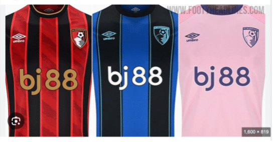
🔵 AFC Bournemouth
Okay, the blue away kit? Chef’s kiss. Pink one’s kinda cute too. Dulwich Hamlet energy? We see you.
🔴 Arsenal
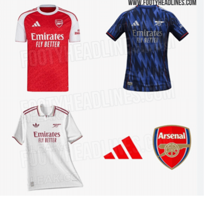
Forget the match kits — the training gear is where it’s at. African vibes last year were elite. This year? Rainbow-core. But that all-white third kit? Nahhh, had to squint during the Utd game. Not the Arsenal we know.
🟣 Aston Villa
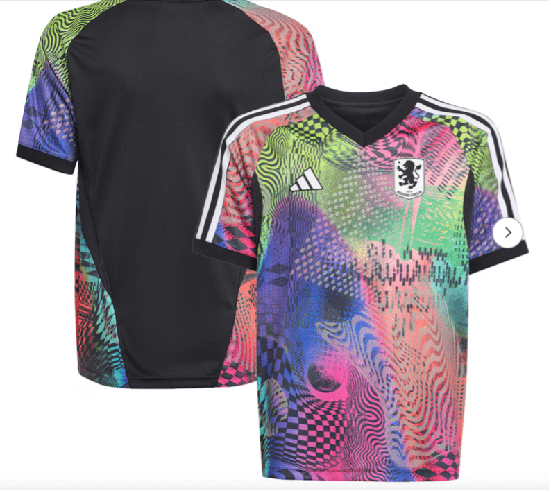
Same old claret and blue, but that Pride kit? Adidas x Jeremy Scott? ICONIC. Wear it loud, wear it proud.
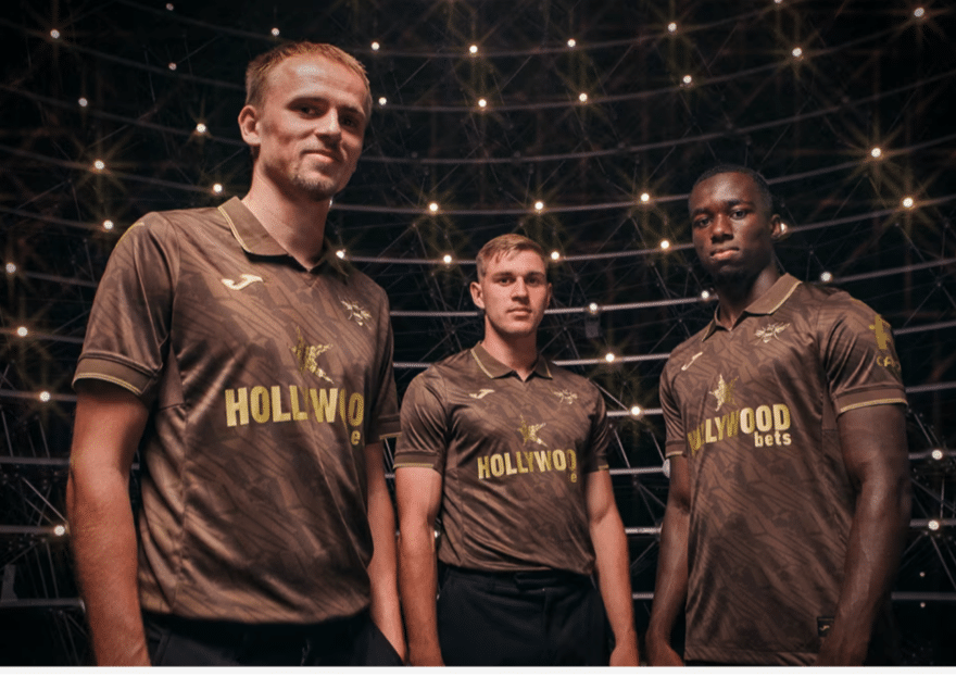
🍫 Brentford
Brentford said “let’s be bold” and dropped a chocolate brown kit. We said “1970s curtains.” It’s a no from us.
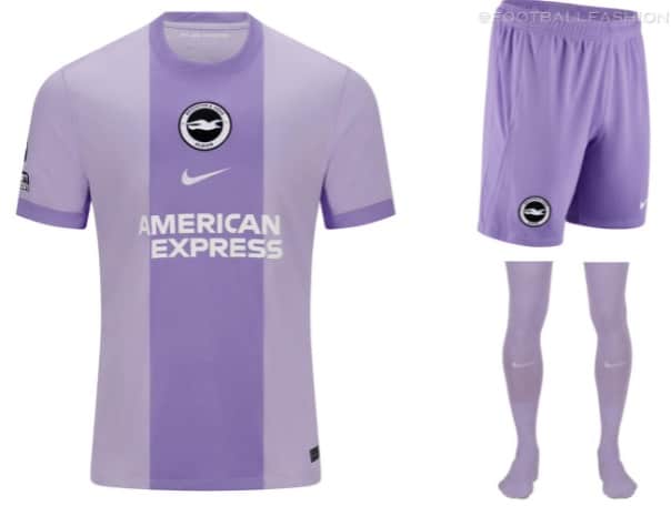
🟪 Brighton
Purple kit had us thinking the TV was broken. It’s giving glitch. Way too much.
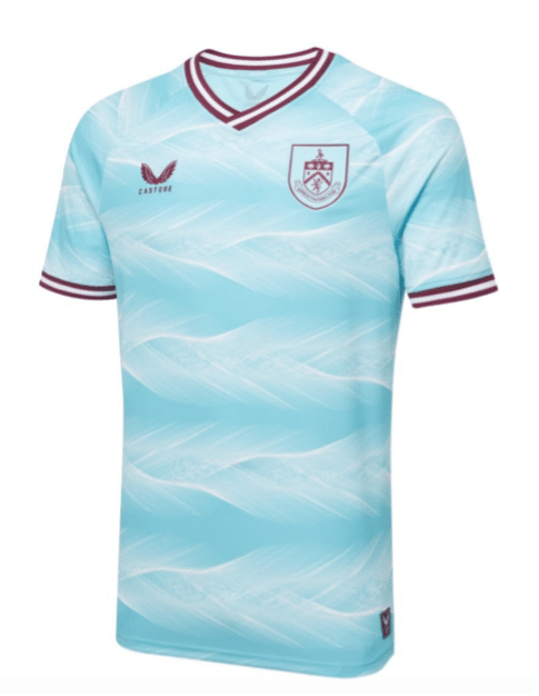
🥂 Burnley
Classic claret and blue — always a win. Feathery away kit is kinda vibey. But the third kit is called caviar?? Fancy much?
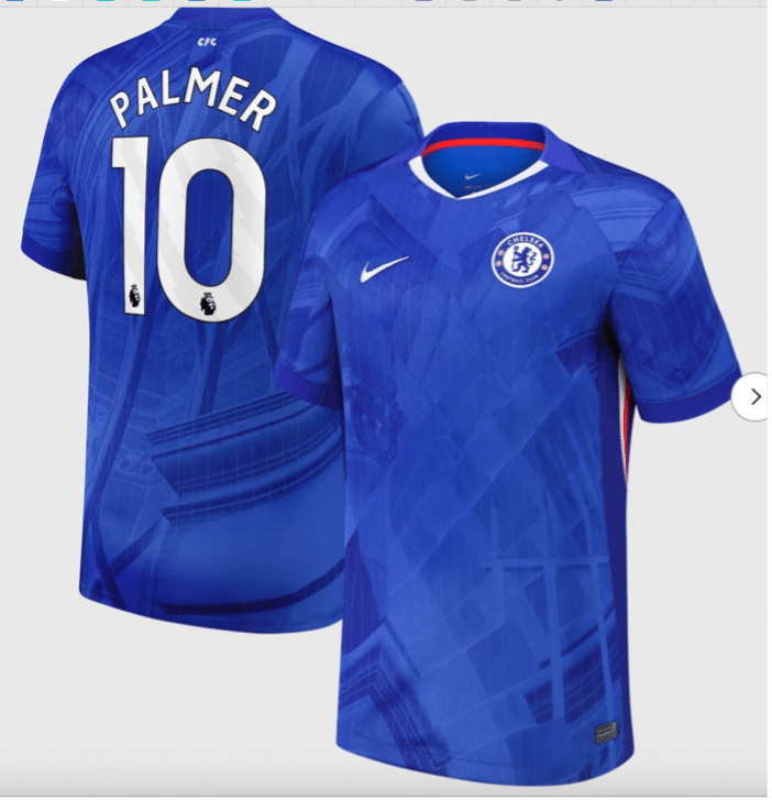
🔵 Chelsea
Cole Palmer needs to get playing 😭. Home kit ditched the vape swirl — thank god. Away kit lowkey looks like Germany’s. PTSD unlocked.
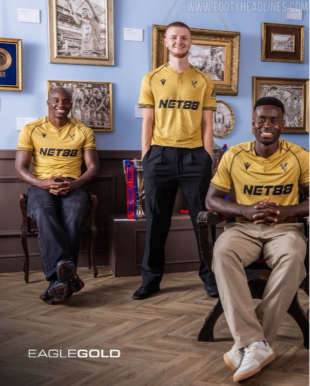
🔴🔵 Crystal Palace
Pinstripes on the home kit = classy. But the away kit? The gold is everything. Celebrating their FA Cup win like true legends.
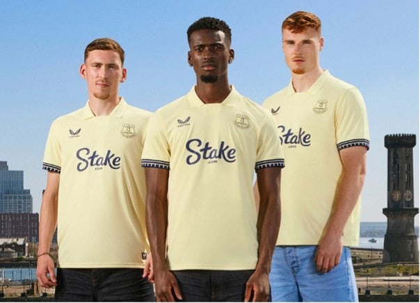
☁️ Everton
Is it yellow? Is it cream? It’s giving oat milk. Dock references for the new stadium are cute tho.
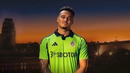
⚡ Fulham
Neon alert 🚨. Whole squad looks like keepers. But we kinda love it?
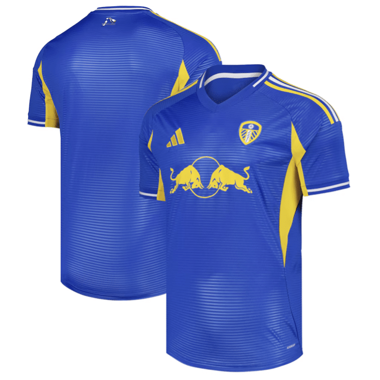
🟡 Leeds United
White home kit = timeless. Blue away kit = 🔥. Yellow Red Bull logo is chill, stripes add spice. This one slaps.
🟢 Liverpool
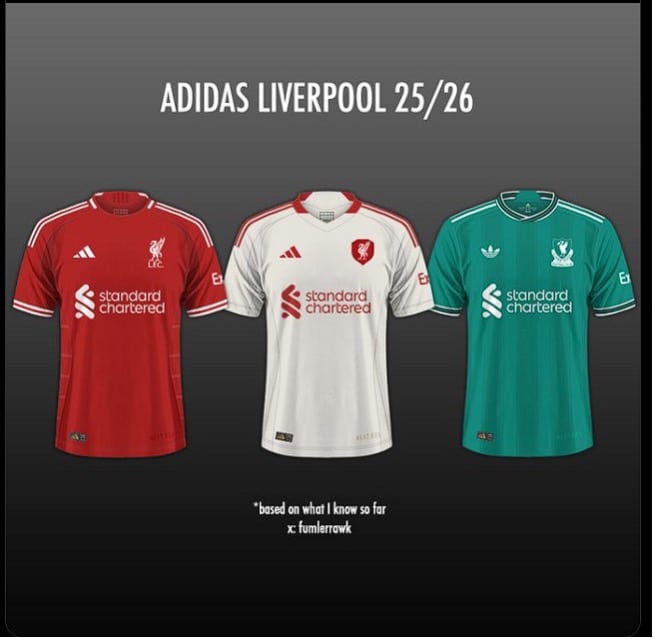
Teal is BACK, baby! Only as the third kit tho 😢. Big 90s throwback and Jan Molby vibes. Can’t wait to see it in action.
🖤💚 Man City
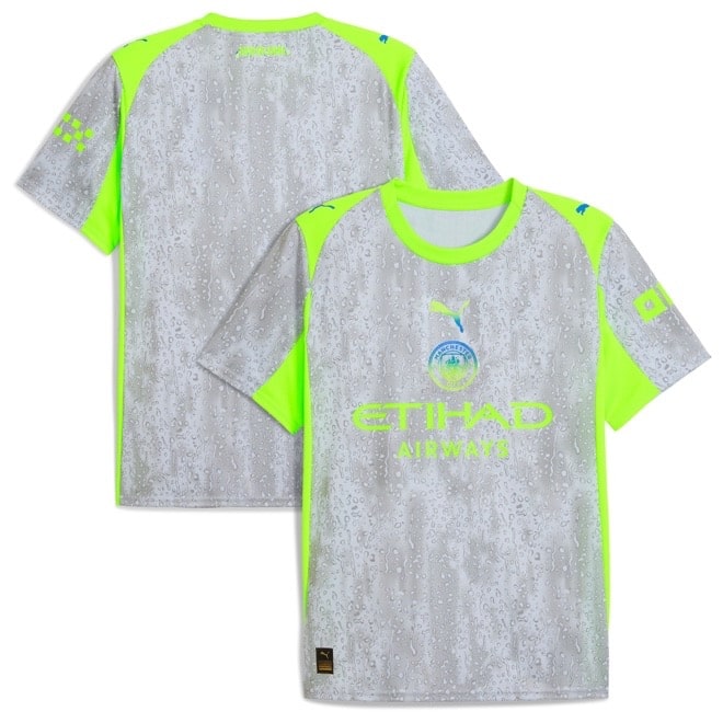
Home and away kits are meh. But the third kit? Grey + neon green = futuristic drip. Might look wild on pitch tho. Jury’s out.
🔴⚪⚫ Man United
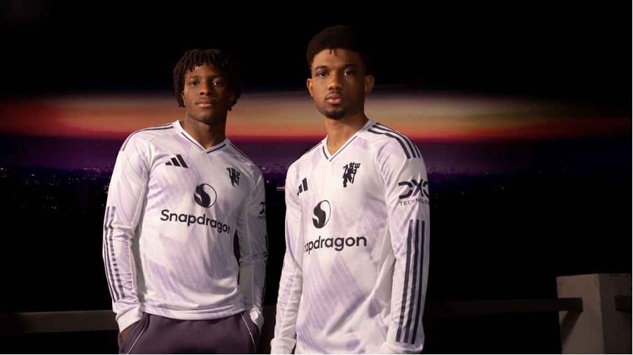
Red, white, black. Yawn. It’s giving “we didn’t try.” Do better pls.
🟢🟠 Newcastle
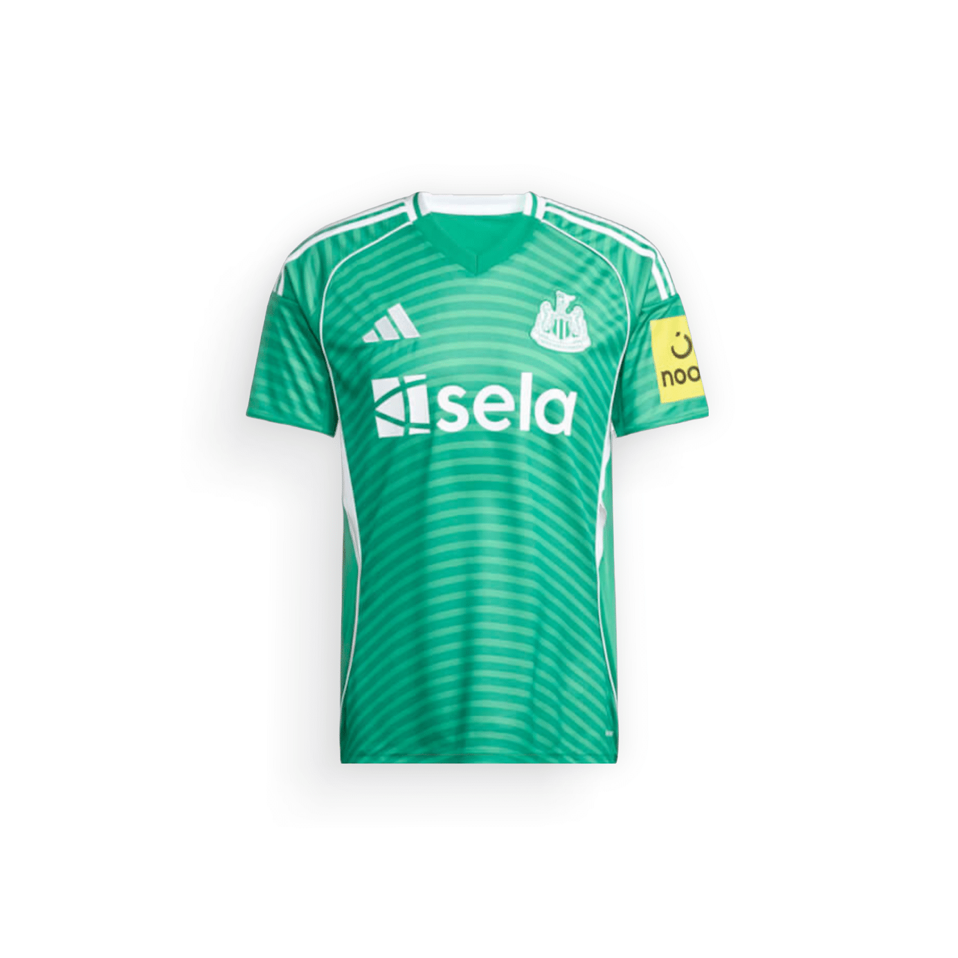
Mint kit looked cute online, but IRL? Poster paint green. Betting app vibes. Blue/orange away kit tho? 90s nostalgia. We’re here for it.
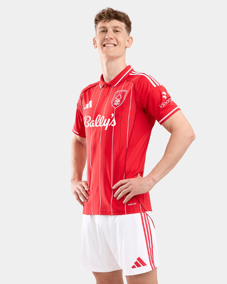
🔴 Nottingham Forest
Home kit with pinstripes = classy af. Navy third kit is solid too.
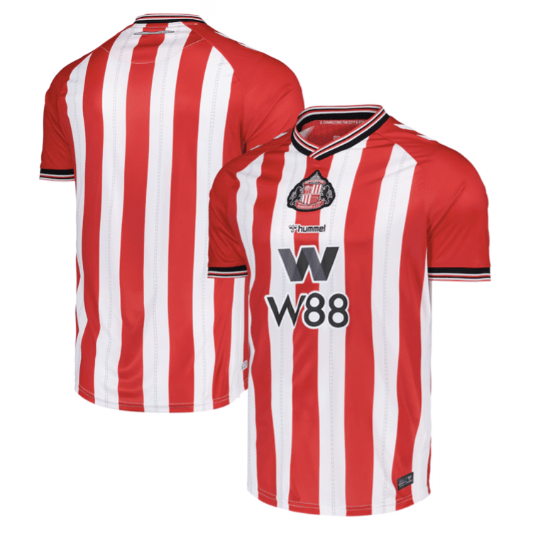
🔴⚪ Sunderland
Just a lil reminder they’re in the Prem 👀. Home kit is handsome. Respect.
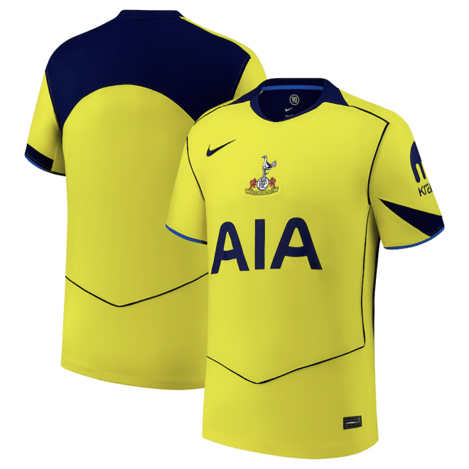
🧤 Tottenham
Third kit looks like a keeper’s kit. Seems to be a theme this year. Not mad, just confused.
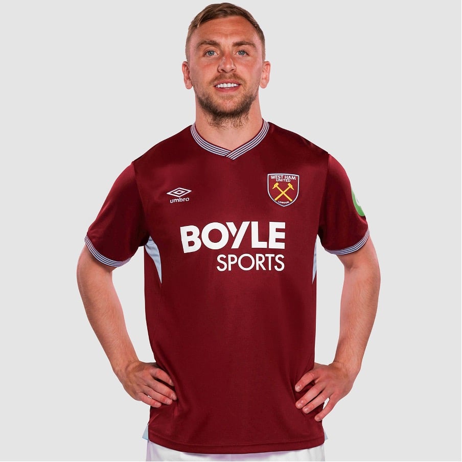
⚒️ West Ham
Claret and blue forever. Away kits in black and white. No surprises, but still pretty.
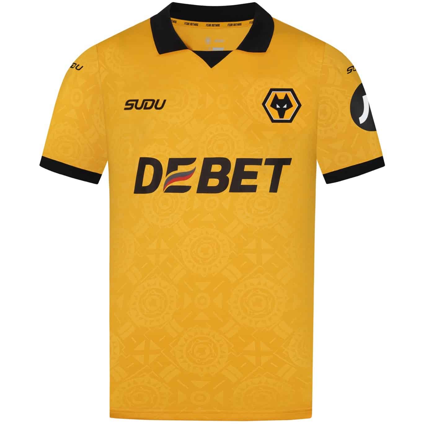
🐺 Wolves
Same vibes as usual, but the home kit has a debossed print repping Molineux history. Subtle flex.


